
Diagramming to Understanding Your Data Estate with Rob Long
AgileData Podcast #76
Join Shane Gibson as he chats with Rob Long about diagramming patterns that you can use to quickly document and share your data estate.
Listen
Listen on all good podcast hosts or over at:
Subscribe: Apple Podcast | Spotify | Google Podcast | Amazon Audible | TuneIn | iHeartRadio | PlayerFM | Listen Notes | Podchaser | Deezer | Podcast Addict |
You can get in touch with Rob via LinkedIn or over at:
The article we talk about in the podcast episode:

Tired of vague data requests and endless requirement meetings? The Information Product Canvas helps you get clarity in 30 minutes or less?
Google NotebookLM Mindmap

Google NoteBookLM Briefing
Executive Summary
This document synthesizes key insights from a discussion with data strategy consultant Rob Long regarding the use of Data Producer-Consumer Diagrams as a powerful framework for understanding, managing, and communicating the complexities of a data estate. The core concept involves mapping the flow of data through a series of Producers (entities that generate/capture data), Consumers (entities that use data for a purpose), and Handovers (the interfaces between them).
The primary value of this approach lies in its ability to create a unified, workflow-driven view that integrates disparate organizational artifacts like organizational charts, technology architecture diagrams, and data lineage maps. These diagrams are not meant to replace existing technical documentation but to complement it by providing a more accessible, story-driven perspective. They can be tailored in granularity—from high-level conceptual models for executives to detailed technical maps for engineers—allowing for targeted communication.
Key applications include clarifying team roles and responsibilities, performing impact analysis for technology changes, defining the scope of data contracts beyond mere technical schemas, and identifying process inefficiencies. By visually representing the interplay of people, processes, technology, and data, these diagrams provide the necessary scaffolding for informed, strategic conversations and decision-making, ultimately reducing organizational friction and aligning data initiatives with business objectives.
--------------------------------------------------------------------------------
1. The Producer-Consumer Framework
The foundation of this methodology rests on a simple yet powerful set of definitions derived from systems thinking, providing a common language to describe any data workflow.
Core Concepts
Data Producer: An individual, team, or system responsible for generating or capturing data. Examples range from a physical sensor reading temperature to a CRM system capturing customer interactions.
Data Consumer: An entity that receives and utilizes data for a specific purpose, such as answering business questions, training a model, or generating a report.
Handover (or Link): The critical interface where a Producer transfers data to a Consumer. This encompasses the mechanisms and agreements governing the exchange, including data contracts, quality checks, compliance rules, and delivery formats.
This terminology is analogous to the systems thinking concepts of “Nodes” (where a job is done) and “Links” (the handover between nodes).
Fundamental Value Proposition
The central benefit of this framework is its ability to unify disparate views of a data estate into a single, coherent narrative. As described by Rob Long, “it helps give you a unified view of your data estate... together they give you that workflow driven kind of diagrams which help unify everyone and reduce organizational friction.”
Complements Existing Artifacts: It enriches traditional documents like vertical organizational charts by providing a horizontal, workflow-oriented perspective. It integrates views of people (org charts), technology (architecture diagrams), and data movement (lineage diagrams).
Workflow-Driven Perspective: The diagrams focus on the end-to-end flow of work and data, clarifying how value is created and transferred across teams and systems.
Establishes a Common Ground: By using a simple, intuitive model, it allows technical and non-technical stakeholders to engage in meaningful conversations about complex data processes.
2. Key Applications and Use Cases
The producer-consumer diagramming approach is a versatile tool with a wide range of practical applications for data strategy, architecture, and team management.
Mapping a Multi-Layered View
The framework is capable of mapping multiple organizational dimensions onto a single diagram, providing a rich, contextualized picture. This includes mapping:
Data systems and their interactions.
The flow of data through different architectural layers (e.g., Bronze, Silver, Gold in a Medallion Architecture).
Team design and the boundaries of responsibility.
The specific technologies and tools used at each stage.
The personas (e.g., Data Engineer, Business Analyst) involved in the workflow.
Variable Granularity for Diverse Audiences
A key strength is the ability to adjust the level of detail to suit the audience and the story being told.
High-Level (Executive View): A simple map with a few nodes (e.g., “Source System,” “Data Lake,” “Data Warehouse,” “Reporting”) can tell a clear, conceptual story without overwhelming detail.
Fine-Grained (Technical View): The same map can be expanded to show intricate details within each node, such as specific data quality rules, data mastering processes, metric definitions, and the technologies involved.
This flexibility allows for the creation of “variants very simply which tell different stories for the audience.”
Enhancing Handovers and Data Contracts
The framework places significant emphasis on the “handover,” treating it as a critical point for negotiation and clarity.
Identifying Waste: It helps uncover process inefficiencies, such as when a producer generates data that is never used or when a consumer needs information that is not provided, forcing them to perform redundant work.
Informing Data Contracts: The model is crucial for defining what needs to go into a data contract. It pushes the concept beyond technical specifications (schema, field types) to what it truly should be: “an agreement between two parties... a negotiation between the producer and the consumer about what’s needed for both sides to do their job well.” This includes non-technical aspects like documentation levels and support expectations.
Facilitating Feedback and Agile Processes
The diagrams inherently support modern development practices by visualizing necessary communication channels.
Feedback Loops: In reality, data flows are not purely unidirectional. The model highlights the importance of feedback loops from consumers back to producers to report errors, document issues, or request changes. This moves teams away from “throwing things over the fence” and towards collaborative problem-solving.
Agile Gates: It provides a structure for implementing agile patterns like “Definition of Ready” (what a consumer needs before starting work) and “Definition of Done” (what a producer must complete before handing off work).
3. A Practical Example: Mapping a Data Workflow
A concrete example illustrates how these concepts are applied to map an entire data pipeline, layering multiple dimensions of information.
Scenario Overview
A common data workflow can be visualized with five primary nodes:
Source System
Data Lake
Data Warehouse
Analysis/BI Layer
Report
Layering Information
This basic flow can be enriched with additional layers of context to tell a more complete story.
Derived Insights and Strategic Questions
This single, relatively simple diagram immediately provides significant value:
Quick Comprehension: It tells an instant story. An observer can see, “you’re a Microsoft stack... I’m not seeing Snowflake, I’m not seeing Databricks.”
Generates Insightful Questions: The map acts as a catalyst for deeper inquiry. For instance:
Are the Data Analysts read-only in the Data Warehouse, or can they write transformations?
Where are business metrics defined? Are they only in the Power BI semantic layer?
Is there a mismatch between the GUI-based tools (Power BI, Excel) and the skills of a potential hire who is a “hardcore Python coder”?
Identifies Boundaries: The diagram visually delineates responsibilities. It becomes clear where ownership lies within a single team (e.g., Analyst BI to Report) and where cross-team handovers occur (e.g., Data Engineering to Data Analytics), highlighting areas that require formal processes for communication and problem-tracking.
4. Strategic Benefits and Implementation
Beyond tactical mapping, the producer-consumer framework is a strategic tool for driving change, fostering alignment, and building robust data capabilities.
Driving Informed Decisions
The diagrams provide “the scaffolding for meaningful conversation and decision-making.”
Impact Analysis: They make the “blast impact” of a proposed change instantly visible. For example, replacing a BI tool is not just a single change; the map shows it could necessitate replacing “one-third of our data layered architecture.”
Challenging Assumptions: By providing a concrete reference point, the diagrams allow stakeholders to challenge decisions with an informed opinion, moving conversations away from pure conjecture.
Collaborative Creation and Alignment
The process of creating these diagrams is as valuable as the final artifact.
Workshop Approach: A highly effective method involves collaborative workshops where a team jointly maps its processes. This is a quick way to document workflows and often reveals stark differences between how leaders believe work is done and how it actually is.
Synthesizing Perspectives: Another successful technique involves creating separate diagrams with different groups (e.g., technical contributors, managers, executives) and then bringing them together. This process uncovers misalignments in definitions (e.g., what constitutes a “data set”) and processes, leading to the creation of a new, shared “truth” that becomes the adopted standard.
A Tool for Strategy, Not Just Technology
The framework encourages a holistic view of data strategy, aligning with the “four pillars” of People, Process, Technology, and Data. It forces a focus on foundational questions before technology selection:
What does success look like and how will it be measured?
What team design and ways of working are needed to achieve the goal?
The architecture then becomes “a means to the end... how you achieve the goal, it’s not the goal.” This helps in designing a “minimal system to achieve the goal and to hit success” rather than an over-engineered solution.
5. The Underutilization of Systems Thinking in Data
Despite the long history of systems thinking in fields like lean manufacturing, its application in the data domain remains rare.
The Communication Gap
The reluctance to adopt these end-to-end mapping techniques may stem from several factors:
Hyper-Specialization: Data roles are often highly specialized (e.g., Scala developer, dbt modeler), with practitioners not always being taught to consider the entire system.
Lack of End-to-End Onboarding: Unlike factory workers who “walk the line” to understand the full process, data professionals are often not onboarded with a holistic view of the data flow.
Communication Skills: There is a recognized gap in “soft skills,” particularly the ability to communicate complex technical ideas to diverse, multi-disciplinary audiences.
Bridging the Technical and Business Worlds
Producer-consumer diagrams are a vital tool for bridging this gap.
Making Complexity Accessible: They distill complex ideas into simple, understandable stories. As Rob Long notes, a key skill is to “make information accessible, whether that’s just choosing the right type of diagram, using the right vocabulary.”
Educating Stakeholders: The diagrams can be used to explain technical concepts like data lineage at a conceptual level to executives. This isn’t to make them experts, but to build awareness so they can better understand the value and necessity of investments in areas like data contracts and observability.
Fostering Business Acumen: The framework encourages data professionals to become more business-driven by understanding how their technical work fits into the broader value stream, aligning with the principle that “as companies want to become more data driven, data engineers should want to become more business driven.”
Tired of vague data requests and endless requirement meetings? The Information Product Canvas helps you get clarity in 30 minutes or less?
Transcript
Shane: Welcome to the Agile Data Podcast. I’m Shane Gibson.
Rob: I’m Robert Long.
Shane: Hey, Rob. Thanks for coming on the podcast. Today I wanted to have a chat to you about this article you wrote that I really loved. It was called data Producers Consumer Diagrams, and Understanding Your Data Estate. But before we rip into that, why don’t you give the audience a bit of background about yourself.
Rob: Yeah, I’d love to. So I got started with data in academia. So I actually have a PhD in applied mathematics and geophysics. So I was doing mathematical modeling and numerical simulation of planets and stars. Things like sun spots and storms on Jupiter. And without realizing at the time what I was doing was bringing machine learning and data engineering to that field. ‘ cause these simulations generate big data and we were implementing. Supervised machine learning, but it was still a step up for that discipline group of people. Since then, I’ve dabbled all over the place, so I had a couple of years where I run a software as a service, helping schools in England improve their national ranking. So again, very data centric. And then throughout my career I’ve gone through and I spent a couple of years as a senior data engineer in defense in the uk, so really helping ‘em upskill and using cloud platforms, how they do data, and was using GN AI to help with content creation, so scripts, audio imagery, things like that. And now I’ve moved from the UK to the US at the start of this year, and I run a consultancy where I focus mainly on enabling analytics. So lots of data engineering work and data strategy. And that later part is really where this kind of producer, consumer framework came from as I’ve been helping. Companies new to data Build the foundation. So really getting them set up on the right path. And that’s how this kind of came to be.
Shane: Let’s do a little bit of anchoring around terms, ‘cause you use slightly different terms than I do, so we’ll anchor those. So just talk me through this idea of how you define a data producer, a data consumer, and the concept of a handover.
Rob: So I think a producer, a very broad strokes, is an individual, a team or system that produces, which means to generate or capture data. So that could be thermometer, reading temperature, it could be a CRM system, whatever it is. A data consumer is someone who takes in that data for a purpose. And so there you’re thinking they need data to look a certain way so they can use it to answer certain questions. And then a handover is really this interface with the two meet. So that’s where a producer is literally handing over, in this case, data to a consumer. And so there you might, think about terms like data contracts you might have quality checks, compliance, whatever it is. And so I build these networks on those three ideas really.
Shane: So the language I tend to use is I was a great fan of a TEDx video called How to Make Toast. And it’s around system thinking, so very much the same. And he talks about nodes and links. So for me, I talk about nodes and links. Node is where a job is done, something happens, and then the link is the handover to another node.
Data producer in terms of data’s created in the CRM or a sensor is creating an event that is a node and when it moves to somewhere else to get worked on or consumed, use a link to the next node. I’ll jump between your terminology and my terminology all the way through as I always do. So we’ve got this idea of producers, consumers, and handovers or nodes and links . How do we use them? ? Why do we care? ? Where’s the value?
Rob: I think the value is really in unifying other things that already exist. So lots of companies, for instance, might have an organization chart, which gives you an almost vertical view of the roles or teams and where they sit. But as we know, lots of data work happens horizontally. But there again, it’s not to replace org charts, but it helps enrich them because these producer consumer diagrams are very workflow driven. We’re trying to capture a flow from start to end. so that’s one use case where it lets you overlay these different artifacts you already have. As I said, an org chart is typically representing people. You might have your architecture diagrams, which represent technology. You might have data lineage or flow diagrams, which capture how data’s moving through these systems and. All of them, to some degree, you can represent as producers and consumers ‘ cause they’re either generating or using data. And so I think this is really powerful ‘cause it helps give you a unified view of your data estate. All of these artifacts are really good, but together they give you that workflow driven kind of diagrams which help unify everyone and reduce organizational friction.
Shane: I agree. I think the idea of using a map or a diagram to visualize a concept is really valuable as long as we don’t overload it . We don’t make it too complex in itself. So those maps should be as simple as possible. And so we can use it to map systems. We can, like you said, we can use it to map all charts.
We can use it to map flow of data. We can use it to map data layers and the rules on each of those layers. We can use it to map team design. We can use it to map a flow of work as you say, somebody works on something and then hands it off to somebody else who uses that. I think, if we go back to some of the original data mesh thinking there was this idea of input and output ports.
So we’re talking about that, somebody does a bit of work and it gets handed over to somebody else who does another bit of work, and we just visualizing that workflow or that flow. Is that how you see it?
Rob: That’s exactly it.
Shane: Let’s give a an example, concrete example. Talk me through, an example of one of these maps.
Rob: Going through an example is really useful. ‘cause there’s also this concept of you can look at different granularities and I showed diagrams of that in the article where at a very high level you might just have your external system, which is producing data, and then you bring it into internally into your architecture where you have your own processes for data.
So there we’ve got the external being the producer, the internal being the consumer. But if we look more deeply internally, we might have a data preparation layer where we ingest, do quality, create our data models, and then the reporting function, which takes that middle block, which is now consuming data and producing data. So you get this cool thing of, as you add nodes, things can turn from just being a producer to a producer, consumer. And so I think there, that’s an example where these networks are dynamic, but they also can have as much information as you want ‘em to have. So to your point, at a very high level, you might want a very few number of nodes and keep it almost like a conceptual model. And then as you go down, you might want to get into the real nitty gritty, detailed view to understand exactly for instance, which technologies are doing what, which teams are responsible where, and things like that.
Shane: I think the level of detail can vary. So for example, if we think about layered data architectures, which have been around for donkeys, but are now hotten and popular again because of the medallion architecture, we can have a very high level map of nodes and links where there’s five, source system, whether it’s produced, data’s generated, bronze , silver, gold and then the consumer.
And that’s only five nodes, and it tells a very simple story. Now, what we know as data people is there’s a whole lot of extra complexity. Where’s the data quality rules been applied as the data contracts across each of those nodes. There’s nodes within that. Whenever we get into silver, how are we conforming data?
How are we mastering data, how we bring in and reference data a whole lot of things, where are we defining those metrics? So we can take that very simple diagram and then with only the five nodes, and then we can break it down to even more detail when it makes sense, so we can present the same system with two different stories depending on who our audience is and the story that we want to tell.
Rob: I think that’s really powerful. That’s exactly right, is as you said, you might want the data engineering team to understand what goes on within the silver layer, but your business analysts who are consuming at the end, they. Don’t necessarily need to know care or even have access to the data that’s there. And so that’s exactly right. It’s powerful because you can create variance very simply, which tell different stories for the audience and it lets you again, unify all those other bits as needed.
Shane: One of the other ways we can use it is this idea of when there’s a handover or when there’s a link, what’s actually involved. So what is handed over? Is it just a blob of data? Is that a blob of data with a schema? Is it a document? What does the person hand over to the next person?
What does the producer hand over? And what does the consumer expect? What do they need to be handed over to them to do their step in that process? And a lot of people don’t think about that. We don’t bring in that lean system thinking to say, actually, where’s waste in terms of we, the producer generates some stuff that’s never used, but also waste because the consumer needs some information that’s never provided and now they’ve gotta go and do all that work again and introduce that wasted effort that’s already been done because nobody told them that it has been done or what it was.
Rob: It plays into a bigger story of kind of, in a very ideal case, if everything’s perfect, these are very unidirectional networks. You take data from source process it, it’s perfect. So it’s consumed. In reality, it’s more complex because you want to empower consumers at each handover to be able to report errors and feedback and say, you’ve given me this with a bunch of columns, that I dunno what they are ‘ cause they’re undocumented or they’re new in the API or for whatever reason. And so it’s really important to have both the producer driven flow, which is in my mind, left to right from source to target, but to have the feedback loops that go in the other direction. And so then you can have both the functional benefits of fixing errors quickly, knowing that they exist, what have you, but also from a very almost people level, remove some of the idea of playing the blame game because you’re no longer throwing things over the fence. It’s about having well-defined processes so that everyone can work together to fix these problems, and I think that’s really important.
Shane: Yeah, and if we look at it again from that system thinking, we can have different lenses on what those processes are. So for example, if we look at the flow of data, we can look at data contracts. And we can look at data contracts more than just system of capture to the people doing the data wrangling.
When we get it into that rule layer, we can actually have data contracts between every node and link. So if I’m transforming some data and creating a metric, what’s the contract for that metric? Is there a standard YAML format? Is there a certain descriptive metadata I’ve gotta store?
We can actually put data contracts in between each of those steps.
If I look at way of working, we can bring out some of the patterns from Agile and Scrum where we can do definition of ready, end definition of done. So the consumer can say, Hey, if I don’t get given these things, then you don’t meet my definition of ready.
Therefore, I’m not gonna start work because I don’t have the tools I need to do the job. I need to do. As a producer, I can have a definition of done. Here’s all the things I would expect. Myself or anybody else in my team to have done before I’m saying the work’s done, it’s ready to be handed off to the next node or the next consumer.
So we can bring that idea of gates and patterns and patent templates into both the way the data works, the way our data platforms work, and the way our teams work.
Rob: Exactly that, and that’s why I really like this idea and I think that. , It’s always gonna come up by the idea of data contracts, which is, that acceptance criteria between producer consumers for data sets effectively. But, producer consumers are really important for telling you what needs to go into a data contract. ‘ cause it’s far more than just technical as you said, because if the analysts are receiving data from an engineering team, they need and expect a certain level of documentation, formats, whatever it is. And so it is really about, yeah, removing friction and unifying those requirements and expectations from both sides. So that’s exactly why I really like these. The framework is the Pattern to use.
Shane: And I think one of the things about data contracts is everybody looks at it from a technical point of view. They look at it as what is the schema, what is the field type? What is the grain? But they forget the actual word contract, which basically means an agreement between two parties.
So it is a negotiation between the producer and the consumer about what’s needed for both sides to do their job well. that’s how we should treat it, we should actually negotiate the contract, not just treat it as a technical task.
Rob: I a hundred percent agree, and I think that’s probably improving, but at least in lots of cases, I’ve seen , data contracts are taken to be technical andnot have the surrounding pieces, which I think I agree with you. They’re missing
Shane: I’ve never seen a data contract that has the level of documentation involved in the handover unless it was an API contract. . Which is in theory self-documenting. But we don’t put, APIs between our bronze, silver, and gold layers. . We should probably we should definitely put contracts in between each of those moving parts.
We don’t put data contracts in between the way we capture requirements as a business analyst and hand them off to a data team. If we are running separate teams that do requirements gathering in a separate team, that doing bill, which again, I don’t actually suggest you do. Put them in the same team, solves a whole lot of problems.
So one of the other things you have done is you’ve used that idea of consumers and producers to actually map it to tools and technologies that are being used. So just wanna talk us through how you do that and where the value from , that Pattern is.
Rob: As I said, I view these as a way to unify these different lenses, technology people, process data. And so when we talk about, for instance, ingesting data from an external system, we’re gonna use a technology to do that. So I’m gonna use the example of within the Azure ecosystem, because that’s what I mainly work with. But any ETL tool, for instance, Azure Data Factory, you can then, say this edge of this diagram is handover, is going to be performed by Azure Data Factory. And then internally, once you’ve ingested it and gone through your medallion architecture, that’s gonna be some data warehouse, Postgres, synap, synapse analytics, whatever data platform you are using through to, once you get to the reporting stage, you’re gonna have a BI tool, typically, whether that’s Python, power, bi, Tableau. And so really the technologies in general map to the handovers. There are cases where they can be the nodes as well, the producers or consumers. And then I think what also that lets you do, again, the benefit of that is. It lets you have an informed decision about do you really need this technology? So when you’re thinking about cost, performance capability, when you’re talking about does your team have the skills to use this technology or do you have to learn something new again, by bringing it all together, you can make an informed decision about that. So it’s much less the preference of the architect or listen to a vendor pitch and it lets you get that view of what you need to use.
Shane: I think the other thing I liked in the diagram you used as an example is you also bring in the personas. So you are mapping out the flow of the data effectively. Then the technologies, the tools that are being used in each step of that flow, and then the personas, you’re expecting to use those tools.
So you are differentiating between the tools the data engineers will use and the tools are a persona of data analysts.
Rob: Yeah, and as I said, a lot of the people I work with and my clients are. Less mature with their data capability. And so for them, a lot of them start with the Google definition of data engineer or data analyst. So it’s much more useful then to use these types of diagrams, map the technology, and really distinguish the responsibilities of the personas so then they can hire the right people, get the right skills. But it also again reduces friction because if you are brought in as a data engineer and you’ve got clear roles and responsibilities, you’re not gonna kick up a FU because you’ve been given something that you deem as pure analytics or whatever the case is. And so I think again, that’s really useful to have because it gives you that unified view of your data estate and lets you make informed decisions about technology, team structure how data flows from source to target.
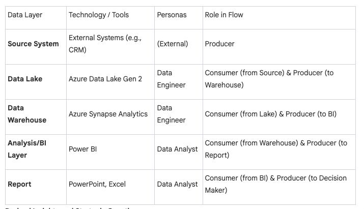
Shane: The thing I like about it’s, it tells me a story that, it’s a map at a high level and I can understand it, I can embarrass some stuff and I can get a bunch of questions. So the one I’m looking at, you start off by saying there’s a source system that goes across to a data lake that goes across to a data warehouse, that goes across to a analysis BI and then across to a report.
So I can look at that and go. I think you’re running a three tier architecture, data lake, data warehouse, and an analysis bi layer. And then you’ve got source systems of data coming, being produced and then reporting content on the right hand side where people go and use it. And then you are breaking it down to tools.
So you’re saying that effectively as Data Factory has been used to extract and load the data into the Lake, synapse analytics has been used to Mung and wrangle the data. Power BI has been used to create the analysis PI layer and then PowerPoint Excel has been used for the primary reporting.
And then you’ve got the idea that data engineers sit on the left and do half the work and data analysts. And so I can look at that and I can go, good. There’s no omni there’s no thought spot. . I can get an understanding quickly of the technology and I go, yeah, you’re a Microsoft stack, i’m not seeing Snowflake. I’m not seeing Databricks. , I know that effectively you’re gonna be on Azure, not GCP and not aws. aws. I can see you’ve got two sets of personas in there. And that raises a question because in the way you’ve laid it out, it looks like the data analysts are reaching back into the data warehouse.
So I can have a question of are they read only or are they actually able to write transformation code in the warehouse? Your analysis bi layer is Power bi, so I’m just gonna assume that it’s dxi. Semantic key thing, and I’m gonna ask you questions around where metrics defined. Are they only in that layer or are they somewhere else?
Your data lake, I’m gonna assume it’s Azure Data Lake Gen two or something like that even though you haven’t specified it. So I’m gonna ask you those questions so again, I can get a really quick map of that environment, of that estate, and I can ask you a whole bunch of questions.
For things that I just want to know because I need to know, or I’m just nosy and I wanna know. And that’s the value of these maps.
Rob: Yeah, and I think what you’ve just touched on is really useful in that you can create different views like we discussed about earlier. So you might have this, which is your more executive focused story, and then for your technical users, your power users, whomever. You might have that more finer grain that you’re talking, where you go into more specifics about technology, about the rules. And again, you could also go more in detail. For instance, in my experience, a lot of frustration and friction comes from the handovers is that mismatch of expectation, definition of ready, definition of done. And so this lets you account for some of those. It lets you see quite clearly who owns which parts.
Is it within one team? So the analyst bi to the report layers are both owned by the data analysts. So the part of the story there is that they should be able to do that internally. Whereas if you look at the handover from data engineering to data analytics, there, we might need some cross team and you have to work out the processes for that. But again , you’re informed of that with this diagram so you can start to flesh out how that’s gonna work. Who’s responsible for what, how communication happens. If it’s a Slack conversation, a Jira ticket, whatever you want to use for that kind of problem tracking. The extra layers of information you can get when you go to finer granularity.
Shane: And I think it’s that idea of a boundary because my eye is naturally creating boundaries and saying these things these nodes, these links are in the boundary of a data analyst, and these other ones are in the boundary of an engineer. And now I’m gonna worry about whether the boundaries look weird to me or whether there’s an the touching of the boundaries or an overlap of the boundary.
One of the things you do though, when you diagram this is you’re effectively bucketing or putting together the consumer and the producer node with no line. And I’m assuming that your visual way of saying that a person consumes something and then produces something, and that in my head is within the node before they hand off to somebody else.
Is that just a visual style of the way you do it?
Rob: It is. So it was trying to capture the logic that, for instance, the data warehouse, it consumes from the previous node, the data lake, and that same data warehouse produces to hand over to the BI tool. So again, you’re right, you can look at this and view this in different ways. For me, it’s really just about having the node label as either producer or a consumer or a producer, consumer pair. And yeah, there’s different ways of doing this. This was one of the simplest ways that I could fit quite a lot of information into a easy to read diagram. And so that’s a complete design choice that I’ve had success with.
Shane: And I think it’s just a choice of language now. I understand that when I look at those, they’re effectively an ensemble. . And I’m looking for ensembles where these consumer producers, which means these in and outs within that node, or I’m looking for one where there’s only a producer or a consumer task effectively.
Again, it helps me tell that story
Rob: And in general, obviously you very rarely want to produce data that’s not being consumed. So in typically they will come in pairs, and obviously there’s always the question of where do you end the diagram. So in the case we’re talking about, the reporting layer says consumer producer, but the producer’s not connected to a consumer. So again, the bit that’s missing from there is that there is a decision maker, an executive who takes that report and makes a decision, takes an action. And so that’s also. Where I say it’s as much art as science when you make these kind of diagrams is there’s no rule for granularity or your starting end points most of the time.
There is a logical start point, but where you decide to kinda end the flow. As I said, it can vary a lot and it really just depends on what you’re trying to convey with that particular story.
Shane: And that’s the important part is you are telling a story. So I could take , that five node one you’ve got of source system data, lake, data warehouse analysis, BI and report. And I could extend it to the right and actually say actions that are taken off, those reports and outcomes are delivered by those actions and value that’s delivered from the outcome.
If that’s the story I wanted to tell,
Rob: yeah, and then you’d obviously sell a third persona, the executive or whatever. It’s Exactly. That’s how easy it is to iterate these and see the difference between where you are. And a proposed change to your process, framework, technology stack, whatever it is, it directly gives you the implications and new connections you need to manage and prepare for.
Shane: And that’s the other part is it helps with the story. So for example, in this scenario, if I said, oh look, I want to introduce a new BI tool, consumption tool, last mile tool I’m even gonna have to find one that is compatible with the power bi semantic BI layer. If not, we know that the blast impact of that decision is we now actually have to have two semantic BI layers or replace the power BI one with one that actually serves multiple last model tools.
So again, I can point to something and say, if we do this, then we are gonna affect that. . And visually point to the map so people understand, oh, holy shit. Actually that’s one third of our data layered architecture that we were replacing. If we’ve only been working on it for six months, maybe.
If we’ve been working on it for 10 years and we can’t programmatically migrate it, we’ve got a lot of work coming. So again, it’s really valuable to be able to point to parts of the map and say, we’re talking about that. We’re talking about the uk, not the us. That’s the value of the map.
Rob: Exactly. That’s it.
Shane: And then the other thing we can do, so we can extend left and right, and we can also change the grain effectively so we can add more rows. So for example, at the moment we’re saying that all source systems are producers and they’re the same. But if I wanted to, I could create different rows,
I could say we’ve got relational versus SQL sources, or we’ve got streaming versus batch sources. So if I wanted to, I could just add more rows more nodes and links as a row to add more complexity or tell a different story to this map. Couldn’t I.
Rob: Exactly. You can add more rows in terms of different sources or even like you said, making it modular and taking out the synapse piece and say, what if I replaced it with Databricks? And then you can obviously also account for new data. So in this case, the data warehouse is just producing datasets to give to the analytics and BI tool. But you might decide that you want to also capture system data from your warehouse. So from Synapse, maybe. How long your spark clusters have been running, how many outages you’ve had, how much it’s cost. And so you can also kind of, not add new rows, but add an extra dimension where it’s not just going left to right, but you have metadata that kind of goes up and down as well. So you can add different directions or paths possible in your network.
Shane: So do you tend to. Design the complex map first and then simplify it to tell different stories, or do you tend to start off simply and then add the complexity as different versions as you go? Which way do you work?
Rob: So I do something very weird, or I start with a super high level simple flow. So I really just want to get the conceptual model right and then I skip the middle bit and jump to the perceived finest grain and do the real in depth these data quality rules, these data contracts, these technologies. Then I backfill the middle bit because I find it really easy to question the requirements at that very high level. And then by jumping to the really low level, find the real complexities. So like I said, if there’s a skills mismatch with the team versus technology, which then I can propagate upwards. I’ve got a few horror stories where I did go from top to bottom, got to the bottom, and then realized something didn’t work.
And you have to backfill the whole thing then. And even though you’re only changing one node, it inherently sometimes changes the nodes that it’s paired with, obviously ‘cause things work differently and connect differently. So that’s how I work. I think it can work both ways, starting at the very high level or very nitty gritty, detailed level. I think it’s a matter of preference and how good your initial requirements are. I find the better the requirements. The easier it is to start at the height level and then go from there?
Shane: And then you are handcrafting these, you are drawing them as if they’re pictures. You’re not using a tool to help you with this.
Rob: A little bit of both. So I do start very conceptual hand drawing in a tool like Draw io, but I do automate some of this with Python in terms of just treating it like a knowledge graph. And you can def create a simple CSV file with your nodes and edges and get it to populate a graph. So I do a hybrid approach to get these ready.
Shane: It’s interesting that there’s a gap in the tooling. I think at the moment, we used to have things like Spark Enterprise Architect, which was a horrific product to try and use. , I used to do enterprise architecture and I’d go into an organization. I was forced to use that tool. I’d if I knew in advance, I wouldn’t take the gig just made you so slow. And such waste. And like you, I just use draw io. But it’s a graph problem, we’re talking about nodes and links effectively ins and outs and relationships. So surprising that actually there’s not a great tool
For defining it, but then also creating the simple stories.
Rob: I say, I think the closest I’ve seen is mermaid js, so it’s diagramming as code. So it works, but you just don’t get the customization to make it more user friendly. So it’s great for spinning up dirty diagrams that a technical team would love, but to sell this to an exec, it falls short exactly as you’re talking about.
Shane: You’re telling a story, so therefore, it helps if the story’s attractive to look at not ugly. And yeah, I’ve done ones where I’ve used some of the lms, so I’ll put it in as a CSV, get it to gimme the mermaid and tax and then put it into a mermaid viewer. But it’s ugly,
It tells a story, but not in the most attractive way. I think the other thing is, again, overcomplicating at your risk. So if you can keep it left or right in an English speaking country, people will understand it as soon as you start branching off to if DL statements where you’re coming along and you’ve gotta go up and or down and again, that just increases the complexity of the diagram and the story you’re telling.
So if that’s the story you need to tell, then do it. I think the other thing is how many lenses or dimensions you bring to it. So for the one that you’ve got here, there’s a flow of the data and the data layers. There’s the technology and then the personas. And I find that three is normally the maximum you get to before, again, you start bringing complexity in.
So if you add another two in there, you’ve gotta do that consciously. You’re consciously saying, I want to make this a more complex technical diagram than a simple map.
Rob: Fully agree. And again, it’s all about knowing your target audience and the story you wanna tell. So again, I think these are, these are not your super technical architecture diagrams, and they’re not meant to replace them. They’re meant to compliment them by giving a view which is consumable by. Your executive team, your managers, whomever else, decision makers who don’t know what the icon for Databricks is, for instance. So when you show them an architecture diagram with networks and tool specific icons, it’s noise and this is about almost filtering that into something useful for that audience.
Shane: one of the ways I use this nodes and link format and this idea of maps is, as a workshop with data and analytics teams when we want to change the way they work. So the way it works is I get the team together. I basically put something on the left and something on the right, either on a wall, if it’s in person or on a virtual whiteboard.
If it’s not. So an example would be data sources on the left information consumers on the right. And I asked ‘em just to brain dump. Brain dump all the data sources on the left and brain dump all the people that use whatever you produce on the right. So I start giving, a bit of a map. And then I say to them just use some stickies and do a stick a node for everything that you do to get the data from that left to that.
Right. It’s always interesting. So some people do very high level stickies. Some people do very detailed. At this stage I don’t care, I don’t give them any boundaries. And then once they’ve done that, I get ‘em to group those stickies together. So effectively, where you’re doing the same task, put it in the same area.
So your idea of, where it’s in, in and out, and it looks like it’s the same. And from there we now have a flow of work. I can get them to use the dot Pattern to say, where do you think it’s broken? Where do you wanna invest and change? And a whole lot of other things. But I find it, a really quick way of getting a team to document their processes without endless interviews and documentation.
And also it’s really interesting when a leader sits in the room and they use the words, but that’s not how we do it, right? We do this and the team just laugh at them and go, no, this is always how we do it. Or when you have two teams that actually have completely different processes, there’s some things that are shared and there’s some things that aren’t kind of looking at from that lens, gimme some examples of how you actually create these diagrams. Is it just you? Have you ever done it in a teaming environment?
Rob: So there’s two ways that I’ve had good success. One is where I’ve been brought in as a almost contractor, and so they’ve given me the requirements and a few hours of someone’s time, so I go through the requirements with them and then create this myself. Then the value is really in the playback and discussion session. But like you, I’ve also had success doing a whiteboard activity where we just go through with maybe one of the data teams, the kind of technical hands-on person to create the flow. Then we go with their manager independently to create the flow. Then we go with the exec level and create the flow. And then you get, like you said, very different viewpoints of how they think things are working. And that’s how you get real change at a process level because it’s not what people thought it was. And so I’ve had great success with that. And then it tends to end with a session where we all come together, put them all up, and go through and discuss differences, similarities, and often we come up with a new truth, which is then the one that’s adopted and implemented. So it’s normally some Frankenstein monster of all of them. But it turns out that’s the one that’s useful because it brings together the different views people have and brings together the best of each way of working. And so that’s really where I think the best lessons learned are and how you actually make change using this as a tool. Yep.
Shane: And I can imagine when you’re doing that again, now you’ve got say, three maps, right? To keep it really simple. So the three expectations of how the system works to help get. Agreement. You can point to parts of the map, you can point to the executive part of the map where it’s got the word AI agent and you can say nowhere in the other two maps.
Does that have any idea of LMS or a, agentic behavior. So we need investment, we need to add that node because it’s just missing. We’re not investing in that right now. So by pointing to things in the maps, you can get agreement to add things and then you can get agreement to take things away, I’m assuming.
Rob: Yep, exactly that. And another similar example is where you might just need to end up updating their business glossary. So it might just be, and this is real case, where the ic, so the technical contributor versus the executive had different definitions of dataset, and so their flows look very different. And it’s just because. Dataset was taken for granted to mean dataset, and there we just, went into the business. Glossary added a new entry, and moving forward communication was easier ‘cause they were talking the same language. So you can both modify things and update how they, work.
Shane: Yeah, actually that’s a really good point is that when you’re doing these maps, you need to be iterating a bunch of definitions of business glossary so that if there is a box, if there’s a node and it’s got a word, that word needs to be defined. . Because otherwise everybody’s gonna look at the map and go, Christchurch, I, that’s Christchurch, New Zealand, no, it’s Christchurch in the UK endorse it. Oh, okay. Actually, it needs to say Christchurch, New Zealand and Christchurch uk. Otherwise we are gonna look at different part of the map thinking it’s the same thing. I think two other areas I’ve seen value during this process, when I get bought in to do data blueprints for organizations, I will create these as a way of articulating a story like you said. . I will help it for me to understand the thing I’m trying to map, the system I’m trying to define as a blueprint. And then use that to test and iterate and get feedback on whether I’m on the right track for what the organization thinks they want.
And the second one is when you go in and do a review or a stock take. I do exactly what you said as well. I will talk to the technical people and get them to help me draw the nodes and links diagram or get them to do it. And then I’ll go read the technical documentation, the solution design any documentation and see how well it conforms to their understanding, because that means one or two things, the documentation out of date, which is typically the case or the people have an impression of how the system’s working, but that’s not actually what’s happening.
So those two use cases , for this Pattern, I found is really valuable as well.
Rob: Yeah, I think we’ve got a very shared experience with those. The last one, which just came to mind was there’s an educational piece, which is really interesting in that when we talk about these nodes and edges, producers, consumers, as I said, I like to use ‘em for different use cases, but for instance, executive level people may not know what a data flow diagram or data lineage is, but if they’re happy with this as a conceptual map, source data warehouse. Analysis, so on. Then you can give the example, for instance of if you may instead make the nodes data sets that then if you think about it, it’s really just a data flow diagram or a data lineage diagram. And so there’s a nice educational piece where something that they’re comfortable with can help them understand something more technical that they don’t run into. And I think that’s actually never the intent, but always a nice side effect of using these.
Shane: I think we need to be careful there though, because all data lineage diagrams look awful. They look incredibly complex. They look like a, Frankenstein version of the London Underground. And therefore we need to be really careful that telling that story has some value.
Because it’s a tool for data professionals to be able to go into the detail to find the bit of nodes and links that they need to solve a problem. I think it’s like data models, and, ghost of data past the enterprise data modeler would print everything out on a or zero, have it up on the wall and be very proud at the size of their data model, the number of nodes and links and how complex it was. Nobody else gave a shit. In fact, it actually did them a disservice because it was like, I don’t understand that. And I think we’ve gotta be careful with data lineage as well. That actually it’s a tool for us for data professionals. It’s not a great map for information consumers.
So I’m with you and understand the concepts and people can look in and go, oh yeah, it looks like a really complex version of what I understand. I probably not gonna go near it ‘cause I don’t need to.
Rob: So yeah, exactly that. When I say to help ‘em understand what it is at a conceptual level. It’s not an excuse to start showing up with those lineage diagrams. However, , it does mean if they know what a lineage diagram is and consequences for contracts, observability, things which can affect cost value, have implications, it’s then easier to get time or money assigned for those types of projects because they have some awareness of it versus you rocking up out of the blue, our observability is a mess. So I fully agree. I’m definitely not saying to try and turn the execs to data lineage experts, but again, just to increase awareness. Something I say a lot is just as companies want to become more data-driven. Data engineers should want to become more business driven. And so it’s all about that.
Just, I’m not expecting data engineers to know the business through and through, but we should be aware of key metrics, processes. . Streams of revenue, what have you. And so I think it’s just about the conceptual awareness more than anything else.
Shane: I think the other thing is the complexity of the map also tells me a story. In our product, we run a relatively simple three-tier architecture. We have history, design, and consume. And then within our design layer, there is effectively three objects you can create. You can create a concept object, which is a list of keys for a thing, customer, supplier, employee product order payment.
You can create detail about it. Customer name, product skew, order quantity, payment dollar amount and you can create an event, a relationship between them, customer order product and that’s it. There’s only three types of objects you can create. And what that means is when I look at our lineage graph, it may have lots of left to rights, but the number of columns in it is very light, which means when I have to troubleshoot, I have a very short conversation with myself.
Is it the history layer? Is it one, the concept detail or event and design, or is it the consumer layer? When I go look at other organizations and, we’re creating a transformation code that has lots of crate tables temporary tables in between, and I’ve now got 16 columns for a relatively simple transformation.
That complexity comes with cost.
And we’ve gotta really understand that. And then the other thing we can do is, if we think about it if these maps become context, if they become metadata, if they become something we can query, we can actually put a boundary around a map and say, Hey, if we replace the source system, how many of those nodes and links, how many of those consumer and producer ensembles need to be touched?
Oh, 250 out of how many? Out of a thousand. Okay. So what we’re saying now is we actually have to refactor 25% of our entire state, and we can get a sense of the cost of that change, at a really high level not in detail, but we can start to really understand how much of an impact on the system we’re gonna make when we make these types of changes.
Rob: Yeah, I don’t have anything to add. That’s exactly right.
Shane: Which again, comes back to actually turning this. Context, this metadata into actual data we can use is probably something that we should think about a lot more. Because I’m like you, I just draw them. I’ve thought about automating them to make my life of drawing them easier, but I haven’t actually thought about using them as a global repository to help me make better decisions.
Rob: Yeah I think there’s something really interesting there because as I said, I see these very much as a compliment to those other artifacts that already exist. Your org charts, your architecture diagrams, data dictionaries, business ies, so I think there is a really powerful layer there that if you could bring all this together as your context layer and then yeah, use that again just as context.
I think there’s something really powerful you could do with that. I dunno, of anyone or anything that’s implementing that or even thinking about that yet.
Shane: And it comes back to ea sparks. And all those standards and the tools that complied with those standards or applied those standards, that’s what they were doing. They were bringing all these different dimensions of lenses about everything we know about an organization. The problem was the tools were just horrible to use.
They weren’t friendly. And then the diagrams they produced were ugly. So I think that’s the key, is you’ve gotta make it easy to create and you’ve gotta make it easy to consume producer and consumer.
But do it in the way you define your system as much as the way you define, the way you work, the way you define your technology, your architecture, and your data flows.
So yeah, I think that’s a good point.
Rob: ‘ cause that’s really what I try to do. I’m a big fan of Dylan Anderson’s posts about people, process, technology and data, the four pillars. And I always use these in that context of bringing those four together and. How you build a data capability or data strategy, which in turn helps you achieve your business strategy, right?
So it’s all about that kind of hierarchy of do what we can and hope that we’ve done enough for it to propagate up into something more meaningful.
Shane: I agree. So when I do the data blueprints, I focus on team design and ways of working flows of work as much as I focus on architecture. ‘cause I got sick of strategies or designs that were just a bunch of technology boxes and none of the other things that were important. The other thing I do add though, is I start up with measures of success which is, if we’re gonna spend all this money changing what we do or implementing this new platform or whatever, what does good look like? How do we measure the investment was worth it, is that increasing the number of self service?
Being done by people outside the data professionals. Is it data or information being delivered faster or with a higher quality? What does it actually look like if we are successful after we spend all this time and money? ‘cause I’m surprised at the number of people that don’t even think about that.
They just deep dive straight into the architecture map,
Rob: yeah. Whereas I think, again, I’m fully aligned with you stuff like the architecture map are almost a means to the end. It’s how you achieve the goal. It’s not the goal. And so I also start with the people and process driven part. What do we want to achieve? Ways of working to achieve it. How do we know we’re successful? And then as I said, things like then your team design or responsibilities, they then inform my architecture choices. A lot of times I’m never gonna suggest to someone who’s got two data people on their team. To try and pick up you a enterprise level data platform plus storage, plus BI, or whatever the case is.
It’s all about almost the minimal system to achieve the goal and to hit success. And that’s again why I think this just helps my thought process. Keep it simple, keep it trackable, and just have impact versus bells and whistles, which you can always add on later as and when you need them.
Shane: And again, going back to that diagram you did, I can also see, ways of identifying who we’re gonna hire. And the one that you drew, it talks about power bi bean as the semantic bi layer PowerPoint, Excel bean as the primary reporting last mile tool. Then you’re gonna hire analysts that are used to using gooeys draggy, droppy those types of things.
Maybe a lot of Excel, which makes sense going back to the DAX formulas. But if you get somebody that’s, hardcore Python. Coder who wants to just use ACL I there’s gonna be a mismatch between the system that’s in place and their expectations. Now, you can deal with that by giving them a different set of tools, but now we’re gonna have this conversation of how does the hell does a CLI with Python code talk to the semantic BI layer?
Because, sure as shit, they’re gonna wanna punch back into the data warehouse layer and use the data or even back into the lake because that’s what they’re used to, the way they’re used to working. And that’s okay, as long as you understand there’s a mismatch and you’re gonna have to change something.
But if you go in there thinking you don’t, now you’ve got a problem. And I can point to you where that problem is. It’s a mismatch between skills of your analysts and the system you’ve built. So I think that’s important. Again, taking these different maps, different dimensions, and being able to compare them.
Rob: yep. And I think as a consultant, it gives me some validity. I’ve not just given them a list of tech, I’ve not just given you an architecture diagram that you probably don’t understand. I’ve given you not just the tools, but the personas, the workflows. I’ve talked through how I went from your requirements to this proposed solution. And it again, it’s transparent. It lets you have useful discussions with people. It lets you align their priorities, whether it’s cost, people, performance, whatever it is. And that’s why I really like this. And as you said, that kind of mismatch, identifying it early, you then get to make an informed decision. I know I’ve said informed a lot. That’s what these diagrams give you. They give you informed decisions from the start before you are too committed to anything.
Shane: It’s also a decision that can be challenged because again, I can point to a box, I can point to a node, I can point to an ensemble, I can point to a line. I can point to a consumer, producer peer and say, that doesn’t make sense to me. I can point to a handoff and say, that looks like it’s missing something, or that handoff looks like it’s waste.
I can now start to challenge some of those informed decisions with an informed opinion.
And I think that’s important. Again, it becomes less conjecture. . Still an opinion, but I can actually try and get some clarity on where I’m disagreeing.
Rob: yeah. It gives you the scaffolding for meaningful conversation decision making. It’s less about opinions or people there’s still opinions, but it’s less about opinions without context and more about how opinions fit into a workflow, which involves technology, people, data, all the different parts. Yeah, so I fully agree.
Shane: One I remember back in, in the ghost of Dana past when we were doing big requirements up front, so I used to hate it, every now and again, there’ll be one of these mega projects, transformational things, and you used to get a list of requirements and number of the bloody things.
And that was effectively the input into any of the system plans and your blueprints. And I used to map the requirements to the nodes, so this node supports requirements 54 B, 27 Cs. , It helped mitigate some of the arguments that, where did this come from? But I’m not sure the, the juice was worth the squeeze. I kind of found it waste,
What about you? Do you actually map any of these back to requirement statements?
Rob: It depends on the level of the requirement statement, so I definitely don’t religiously apply it to all of them, but I think they are the requirements in general. Give me the context and that’s how I treat it in general. If the requirement is you need to ingest data from system A , that informs some choices. If your requirement is less specific and a bit more hand wave your conceptual, then I’m definitely not going to slog to try and assign it to a node. I’m going to use it as broad context so that then if when the discussion comes up, I can describe my choices in context of that. But that’s it. So I think, yeah, like you in the early days, ‘ cause this came from experience, the reason why I’m attached to this idea is I was working a job where none of this was in place and so we had to do this just out of necessity. And so I think, yeah, I’m like you, I started by very rigidly trying to. Almost one-to-one map the requirements to the flow and it doesn’t work. Or you end up with very rigid workflow and you don’t have any kind of freedom to make something better. And so now I yeah, I put, I’m selective over which ones I directly incorporate versus use context text.
Shane: I think actually as I as I was thinking about it as well I often use the requirements to identify where I have complexity in my map. For example, if I have a requirement that data’s gotta be able to come from the source system, the system of capture or production and be available in a last mile capability to a in consumer.
In less than two seconds I’m gonna have some kind of streaming architecture. And so if I look at your map, yeah. That is a typical batch orientated architecture. Like I could stream it, but I’d be really surprised if it would be streaming with those layers. So if I then have to do another flow, .
If I have to do another row on that diagram, which immediately makes it more complex and that’s only so I can stream, then I gotta justify where that came from and then potentially I could rearchitect the layered architecture. You have to be stream only. If it meets every other requirement, but now it can go back to what’s forcing me to have that complexity and is there any way I can remove the complexity without introducing more complexity?
. Because sometimes having only one row means it’s trying to do too many things. . And therefore it’s even more complex. You’re just hiding it. So yeah, I think actually thinking about it, those broad brush requirements help me again, put a boundary around things and say, I have to do this for these reasons.
If those reasons aren’t valid or important, then I can stop doing those things.
Rob: Yep. I also think. Some requirements are , very specific. And like we talked about earlier, they might only be applied to a finer grain version of this flow. So when I worked in defense, you can imagine there was quite a lot of strict rules about data encryption and personal information masking. So there, I wouldn’t worry about showing that, for instance, the high level workflow, but in the more data engineering focused one, that’s where I would include it. So again, there’s a trade off there in decision about, it’s almost twice the work, but it can be twice as impactful to have those two green views of this one system. One for the kind of exec level, one for the technical level.
Shane: But again, that helps the collaboration conversation. So if you tell me that we need to mask people’s personal identifiable information in that scenario, their names, their date of births, maybe some of their deployment information. I’m gonna ask you, where are we masking it?
Am I masking it in the lake, the warehouse, and in the bi semantic layer?
Or are we saying actually the lake can hold the raw data? When we get to the data warehouse layer, then we’re gonna mask it, which means we now need to control access to that data lake layer that only certain people with certain, authority can see the data in there. So now I have a boundary, nobody’s allowed into that layer unless they pass a certain security level. So again, they’re just helping us make tradeoff decisions and also have a conversation about what happens, where and what doesn’t. And what does the contract look like?
Rob: Yeah, exactly. And then again, it gives you that extra view, like you talked about kinda access control of, if you’re in the cloud, there is a different view of this diagram where you might talk about networking or access management. And again, the exec level probably don’t need to see that, even if it’s a requirement, you might just have that as a bullet underneath with a check mark. But then in the more technical view, you really say, we’ve made this group which has these permissions, and that’s how we’ve satisfied the requirement. Again, it’s all about, yeah, controlling the information you present and which grain you capture those requirements.
Shane: So this idea of nodes and leaks has been around for ages. This idea of system thinking, it came outta lean manufacturing. It’s been around for a long time. The idea of business process mapping and understanding the flow of work being around for ages. The idea of enterprise architectures and diagrams that hold the ability to tell different stories at different levels, been around for ages.
Why do you think in the data domain, it’s very rarely used?
Rob: It’s a great question. I dunno the answer. I think in my experience, data, people have always, for whatever reason, decided not to learn from, say, software engineering, like data engineers. And so data folks tend to be, can be very technical. They’re almost very cultish in like they do data. And I think there’s very few people relative to the number of data folks who actually understand the business and how processes work and how to communicate that. So I think one of the biggest things I learned from academia that I’ve brought to my career is communication is presenting to multidisciplinary audience audiences. And I think that’s something that it’s just skipped if you go from undergraduate degree to an internship and you just that, that piece of learning is missed a lot of the time. And so I’m not saying that’s the only other main reason, but it’s a practical reason I think that I’ve seen in my career that prevents this kind of thing from picking up direction.
Shane: I think we segment the work into hyper specialization and then we start at the lowest level. So we introduce the idea of, a data engineer that’s gonna write code using. Or we bring in, that you’re gonna be an analytics engineer that’s gonna write a model in DBT and we don’t teach end-to-end system thinking as a framework, as a set of patterns that you’ve gotta understand first before you can go and do the work.
If you walk into a factory, and again, I worked in the factory as a kid 30 odd years ago, but you walk the line, you’d understand the flow when you get onboarded, the flow of work from the beginning of the factory to the end so that you understood where your station was what your part in it was.
And I don’t think we do that in the data world. I think the other thing is and one of the reasons I wanted to get you on is that article you wrote, it was simple to understand, for me at least. The thinking is really aligned to the way I think, and that probably helped. But what I often find, especially if I look at academic writing.
It’s really research based. It’s quite technical. It’s lots of complex ideas that aren’t distilled in the story I can understand. , I read them and I’m like, ah, I don’t get it. And so to take that complexity and write it with simplicity is actually really hard. Again, big ups to you for writing an article that distilled what is quite a simple idea, but can be complex down into something that’s easy to understand in the written word.
Rob: Yeah, I think part of that comes from the kind of, even though I’ve jumped fields a lot in my career, the one consistent has been an interest in mentoring and developing others. And so to do that, you really need to be able to make information accessible, whether that’s just choosing the right type of diagram, using the right vocabulary, whatever it is. So a lot of these ideas that I am drawn to. Yeah, it’s often something which I’ve not seen someone else explain quite simply. So I take up the challenge to do it because I think it’s has value to even if only, yeah, two or three people read that and say, I now get it. I’m happy with that.
That’s, that’s worth it. But I think that kind of thinking as you said, the systems thinking, the context, being able to understand how these systems come together, the modular parts that they’re made up of, and then how to communicate that not just between technical teams, so not just between data engineers, but also data engineers and data analysts, but also data engineers with managers with C-Suite. That is I think, one of the biggest gaps. And especially now with, lots of buzz that you see about, we don’t need junior engineers. There’s not just a technical deficit there just because you can outsource some work to LLMs. There is a real issue of new starters, not picking up in quotes, the soft skills, communication skills, and learn how from the start to talk about these ideas, to communicate these ideas. And I think that’s something which is a concern for me and something which I’m podcasts like this, I think do a really good job of starting to address the gap of giving people another avenue to learn something like this quite easily.
Shane: Yeah, I think there’s the whole argument right now about, role of the junior or the role of the senior when we all get 10 xd it’s gotta be interesting because I think education has to change. Because the skills that we learn, the technical skills of how to code are gonna be supported by, the tools of the future, which actually just leaves us the system problem, actually understanding how to daisy chain those tools and that code together to become far more valuable.
But just go back to that writing process. I find it relatively easy to write complex words, I can just brain dump and I can just write lots of complex stuff. But to then refine it down into something that is clear and simple and reduces the complexity and increases the cognition when you’re reading it.
I find that the hard effort, that’s where I’ve really gotta focus and iterate time and time again and spend my time. Is that what you find, or is it like the way you do your diagrams, you find it slightly different in terms of the process you use?
Rob: No, I think it’s quite similar. Again, from my academic work, I would write quite technical, scientific papers, but then I would convert those into PowerPoint presentations for conference presentations and stuff. And so I theory writing stuff like this the same way. So I go from a technical idea that I understand and then I always start by creating the diagrams that capture what I’m thinking and then the words I can just naturally fit around that. ‘ cause once I have the core concept in images, I can just walk through the process of what do you need to know to understand this image? Then what do I want you to take away from this image? And so that’s always my writing process of taking some complex and making it more accessible.
Shane: I think again, that idea of writing some complex words and then drawing yourself a simple map and see what’s missing or what needs to be added, that helps that visual to written and back and forward
Rob: That’s why I always have a notepad on my desk. ‘ cause I always find, even if I’m reading or learning something, if I can draw it out, I can understand it because I’m a very visual learner, like you said. I think so, yeah. That’s how I go through this.
Shane: So if people wanna follow you and read what you’re writing and get some more of these cool ideas, these cool patterns in a way that’s simple to understand, how do they find you?
Rob: So the two best places to find me are on LinkedIn. So Robert S. Long, I think is my handle. And on Substack at Long last Analytics. So that’s the name of my consultancy, my surname’s long, and I like cheesy things, so I like the at long last, I’ve solved your problem aspect, so that’s where you can find me.
Shane: I’ve been reading your stuff for a little while and before you mentioned that, I only just got the joke as I was, as we’re doing this podcast. I was like, ah, actually, hold on. That’s your last name. So well done that. I like cheesy as well, but normally I pick it up a lot quicker than that.
Excellent. All right anybody wants to read what Rob’s writing go to at long last Analytics on Substack hook him up on LinkedIn. Otherwise, I hope everybody has a simply magical day.
«oo»
Stakeholder - “Thats not what I wanted!”
Data Team - “But thats what you asked for!”
Struggling to gather data requirements and constantly hearing the conversation above?
Want to learn how to capture data and information requirements in a repeatable way so stakeholders love them and data teams can build from them, by using the Information Product Canvas.
Have I got the book for you!
Start your journey to a new Agile Data Way of Working.